I’m so happy to take the time to share with you one of the amazing projects I’ve been working on lately. In my everyday life, I get to infuse two things that I like the most about what I do: my creative and strategic side. This time, I was able to do it with a Brand and a sales page project.
This is what Sheylo.co help establish entrepreneurs with.
You already know how I advocate for building sustainable businesses. I believe it all comes from the foundation—the start, which is your brand and your funnel. Creating a strong visual brand is essential for any business looking to make a lasting impact. In this case study, I’ll show you how a strategic approach to branding can help elevate a product and engage its audience effectively.
Introduction to the ScaleUp Project
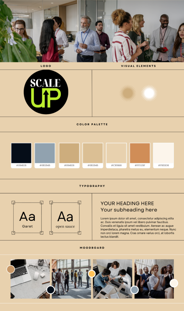
Last year, I was approached to create a brand and sales page for a new project. This product was designed for an event called ScaleUP. The business owner wanted a visual brand that was distinct, modern, sophisticated and faceless (these are the client’s words!).
So, I set out to create a full faceless visual brand from scratch, including the name, logo, sales page and marketing materials. Here are some more details about it…
Brand visual identity
This project is unique because although I’m used to building personal brands this time it is a faceless brand. So to create it I used a strategic approach by linking the market and what was already available to make sure to create something unique that would stand out.
So no I didn’t want to create the usual feminine girl boss faceless brand. Here’s what I came up with making sure it would attract business owners, startups and creators which are the target audience of the event.


Creating the Sales Page
After the visual brand, one of the first materials I crafted was the sales page. For this project, I aimed to incorporate elements of UX/UI design that I had learned along the way. I believe that a page should not only be visually appealing but also functional and user-friendly.
The goal is to make the sales page efficient not only do we want the message to be clear across the section but we want it to drive sales.
Mockup and Feedback
The sales page I developed was a mockup, which mean it wasn’t the final version. It was essential for the client to visualize how the text and images would fit together, and I encouraged her to provide feedback on any elements she wanted to change before the final version.
This process can take a few weeks, that’s why we always recommend that business owners start contacting us a month in advance for a brand and a sales page project.
Strategic Design Elements
Every section of the sales page was designed with a specific purpose in mind.
For example, I used a vibrant green as an accent colour, which was applied to buttons and the logo to draw attention and encourage action. Although very creative I didn’t want to clutter the page wich to many design elements. Sometimes, Less is more.
Sections of the Sales Page
- Hero Section: To introduce the offer
- Event Explanation: Explained what participants would gain from attending the event.
- Why Section: Outlined reasons for attendees to join the community.
- Mission Statement: Provided insight into the brand’s purpose.
- Speaker Lineup: Featured stock images to help the client envision their page.
There are so many important sections on this page and they are all serving a specific purpose, to see more details about it, take a look at it here.
Here’s a preview of the sales page :
Additional Marketing Materials
In addition to the sales page, I created various marketing materials within Canva, including Instagram carousels, webinar presentations, and more. This allowed the brand owner to have a cohesive brand presence across all platforms.

Why Canva?
While many designers prefer more advanced software, I find Canva to be an excellent tool for organizing and creating designs efficiently. It allows me to compile everything into one file, making it easy for clients to access and duplicate materials for their own usage and teams.
If there’s a subscription that is worth every single penny it’s Canva.com.
Conclusion
The ScaleUp case study illustrates the importance of a well-planned branding strategy that combines creativity with purpose. If you’re a scaling entrepreneur looking to elevate your brand or embark on a rebranding journey, consider reaching out for guidance. Together, we can craft a brand that resonates with your audience and drives results with sales funnels.
Thank you for reading along! If you found this case study insightful, you’re more than welcome to join our Newsletter for more branding tips and tricks.

